Wednesday, August 31, 2016

How Do US Renters Fare Compared to Those Around the World?

by Michael Carliner
Senior Research Fellow
The Joint Center’s biennial America's Rental Housing reports examine the rental housing market in the US and have documented the increasing cost burdens faced by renters in this country. To provide further context for US rental housing, Ellen Marya and I looked at rental housing in a number of other advanced countries in a new working paper. Although numerous countries, as well as the European Union, issue reports with rental housing data, they use different measures of income, housing cost, affordability, unit size, number of rooms, and quality, making comparisons difficult. To develop comparable measures, we obtained and analyzed household survey data from Canada and ten European countries, as well as several US household surveys.

 Click to enlarge
Notes: Data for 2013, except Canada 2011
Sources: U.S. Census Bureau, American Housing Survey; Statistics Canada, National Household Survey; Eurostat, European Union Survey of Income and Living Conditions

Figure 1 shows the twelve countries we included. The share of all households who were paying rent in 2013 ranged from 15 percent in Spain to 59 percent in Switzerland. The 33 percent share in the US was in the middle of the range and similar to several other countries. Some non-homeowning households were living rent-free, generally because of their employment or relationship to the property owners. Such rent-free occupants represent a small share of households in the US and most other countries, but account for more substantial shares of households in Italy, Spain, and Austria.

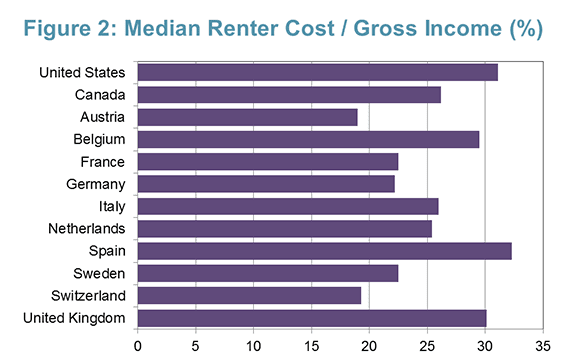
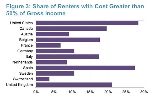
Comparing rental markets in the twelve countries revealed that the US was exceptional in a number of (often unfavorable) ways. The median ratio of housing cost to household income (Figure 2) was greater in the US than in any of the other countries studied, except for Spain, where there are relatively few renters. Moreover, the share of renters with severe cost burdens — paying more than 50 percent of their income for housing — was greater than in any of the other countries (Figure 3.)

 Click to enlarge

 Click to enlarge
Notes: Data for 2013, except Canada 2011

Other exceptional characteristics of renter households in the US included an average household size of 2.39, which is greater than in any of the other countries, except Spain. The share of US renter householders aged 65 or over (12.1 percent) was less than in any of the other countries, again with the exception of Spain. Also, the share of renters living in single-family detached houses was much higher in the US compared to the other countries.

In many other respects, rental housing in the US was not exceptional. While the median living area and number of rooms in US rentals is greater than in most of the other countries, several countries had comparably-sized rental units, especially after adjusting for the number of occupants. (This is in contrast to owner-occupied housing, where units in the US tend to be substantially larger than those in other countries.)

In all of the countries studied, foreign-born householders were more likely than native-born householders to be renters. In the US, 14 percent of all householders, and 20 percent of renters were foreign-born. The foreign-born share of all householders ranged from 7 percent in Germany to 38 percent in Switzerland. The foreign-born share of renter householders was more than 45 percent in Spain and Switzerland.

In each country, lower income households were more likely to be renters than those with relatively high incomes. In the US, about 33 percent of renter households were in the lowest quintile of the income distribution. In six of the other countries, the share of renters in the lowest income quintile were greater than in the US, so the US did not exhibit unusual concentration of rentership at the low end. Because of greater overall income inequality in the US, however, households in the bottom quintile had lower incomes, relative to the national median. Indeed, the median income of households in the bottom income quintile in the US (the 10th percentile) was 24.5 percent of the overall median household income, while among the other countries that ratio ranged from 27.9 percent to 39.1 percent.

Much of the focus of our analysis was on affordability and on the reasons why it is a greater problem in the US than elsewhere. The degree of income inequality is one factor. Another important influence on renters' cost was the availability of housing allowances, known in the US as vouchers. Although US renters with vouchers are provided with fairly generous subsidies, only a small share of renters actually receive vouchers. In France and the UK, about half of all renters benefit from housing allowances. In the Netherlands, Sweden, and Germany, as well, large shares of renters receive housing allowances. Our analysis shows that the effects of housing allowances on affordability are substantial in those countries.

Although affordability in the US is typically measured by comparing housing cost to gross (before-tax) income, in Europe it is common to look at housing cost relative to disposable (after-tax) income. On that basis, the median ratios of housing cost to income for renters in Belgium, the Netherlands, UK, and Spain, were higher than in the US, where taxes are lower. But the share of renters with severe cost burdens (greater than 50 percent of disposable income) was still greater in the US than in every country except Spain.

While the objective of the paper was largely to provide comparable statistics regarding the characteristics of renters and the rental housing stock in a number of developed countries, it underscores the severity of rental housing affordability problems in the US. It doesn't provide a clear answer to the question of how to improve affordability in the US, but it does suggest where to look.

 Read the working paper.

Monday, August 29, 2016

JCHS Fellows Spend Summer on Housing and Community Development

by David Luberoff
Senior Associate
Director
In projects that ranged from efforts to get youth more involved in design issues in Philadelphia, to trying to improve health outcomes for Latino residents of Santa Ana, California, seven Joint Center for Housing Studies Community Service Fellows spent the summer working for non-profit and public entities throughout the United States. The fellowships, which are given to master’s level students at Harvard’s Graduate School of Design, give opportunities to work with organizations that focus on housing, the built environment, and/or community development. Several students blogged about their work.

  • Diana Jih (MLA 2018) worked with Public Workshop and Tiny WPA in Philadelphia.
  • Omar De La Riva (MUP 2017) worked with Latino Health Access in Santa Ana, California.
  • Read all posts by the Joint Center’s Community Service Fellows.
Diana Jih's project with Tiny WPA building a treehouse fort with community volunteers

Thursday, August 25, 2016

Another Look at the Uneven Recovery of Home Prices Across US Metro Areas

by Daniel McCue
Senior Research
Associate
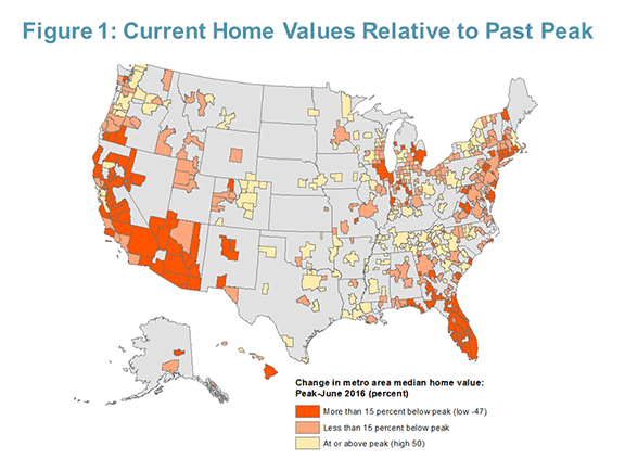
Since the downturn, home prices for the US as a whole have been undergoing a strong recovery and are now approaching their former peak from the mid-2000s. However, the recovery has been uneven across the nation’s metro areas. As of June 2016, median home prices in only about a third of all metro areas tracked by Zillow since 2005 (162 of 474) had regained their mid-2000s peak values. In some metros, home prices remain 20 to even 30 percent below past peaks. To get a picture of the extent to which markets differ, we can examine the recovery in home prices, see where prices stand in metros across the country, and consider the implications of the changes.

At the positive end, some metros have done far more than just recover, with home values rising above past peaks (Figure 1). A few of these metros are hot markets where home values have skyrocketed after substantial declines during the downturn. Examples include San Jose and San Francisco where median home values are now significantly above mid-2000s peaks, following significant declines in the late 2000s. Honolulu and Portland, OR experienced similar trends. However, these four metros are the exceptions, as the majority of metros with above-peak values have not seen particularly strong recent price appreciation and are mostly benefitting from their relatively minor price declines during the downturn. In fact, among the fifteen metros where current home values most exceed past peaks, five had total peak-to-trough declines of less than 3 percent. Five others had declines of less than fifteen percent, which was still well below the US nationwide peak-to-trough decline of 22.4 percent.

 Click to enlarge

At the other end of the spectrum, home values remain far below mid-2000s peaks in several metros, predominately located in the Southwest and Florida. These are areas that had the most severe price declines during the recessionsome declined in excess of 60 percentwhich results in home values that continue to appear depressed despite significant recent rates of appreciation. In fact, metro areas furthest from their former peak values include areas where home values have risen most sharply since the recession. For example, Modesto, California’s median home value has nearly doubled (up 92 percent) since its November 2011 low of $129,400, reaching $248,900 by June 2016. This makes it the metro with the largest percent increase from trough to current, but Modesto’s median home value is still 31 percent below the April 2006 peak of $362,100. This pattern holds true for a number of other metros in California, Florida, Arizona, and Nevada.

Having had a minimal downturn is perhaps the best indicator of whether or not a metro area’s current home values are back above mid-2000s peaks. The top thirteen metros with the smallest peak-to-trough declines in home values over the housing downturn are all fully recovered. These areas were mostly smaller metros located in the Southeast, Midwest, and upstate New York with a history of moderation in home prices. Conversely, the top 24 metros with the largest peak-to-trough declines in home prices during the downturn have uniformly failed to reach their past peak values as of June 2016. Indeed, among the twenty four metros with the largest decreases in home values during the downturn, none have fully regained their peaks. Outside of Detroit, these metros are exclusively located in the West (California and Arizona) and in Florida.

Metros such as Little Rock and Syracuse are at the top of the list relative to past peaks, but are these really the strongest markets for home values? Many areas with the steepest declines since the mid-2000s were also those with the largest run-ups in home values, and the net sum in many cases is still a significant net increase since 2000. Looking at home values relative to year 2000 instead of mid-2000s peaks, we find many of the metros with the highest appreciation since 2000 to be those where home values are still well below peaks from 2005 and 2006 (Figure 2). Meanwhile, many of the slow-growth metros where home values are highest when measured relative to peaks, such as Little Rock and Syracuse, have seen much lower net price appreciation over the longer period.

 Click to enlarge

There are several possible takeaways from this analysis:
  • The housing recovery has been uneven across metro areas. While home values in the US are approaching past peaks, two thirds of metro areas are still below past peak levels from the mid-2000s. 
  • Whether or not home values in a metro area have recovered to past peak levels depends on the size of the downturn in that metro. 
  • Metros with the largest downturns, as a group, are seeing high rates of appreciation in recovery, but the majority have not yet recovered big losses and are still below past peaks. 
  • Being below past peaks does not mean home values are low.  In metros where home values are currently furthest below mid-2000s peaks, home values are still well above levels from 2000.
  • In many of the metro areas that are still well below mid-2000s peaks, net appreciation in home values since 2000 has actually been greater than in areas currently well above mid-2000s peaks that have had more modest rates of appreciation.

Overall, this data appears to suggest a trade-off between risk and return playing out across metropolitan area home values in the US. The high levels of appreciation since 2000 in the highest-growth areas have come with extreme volatility and the need to ride out the downturn successfully. Indeed, one cannot discount the significant housing wealth lost with the downturns, and the fact that those benefitting from recent recovery in prices are not always those who lost out in the downturn. However, while they have received more modest appreciation in home values since 2000 relative to those in high growth areas, homeowners in low-growth areas have not missed out on the ability to build wealth through housing either. Perhaps for many, the moderation of downside in these metros makes their modest housing appreciation look more appealing.

Monday, August 22, 2016

State and Local Governments Take Action to Promote Affordable Housing

by Daniel McCue
Senior Research
Associate
Home prices are rising, rents are up, and units available for rent or sale are few and far between. Detailing these trends, our 2016 State of the Nation’s Housing report once again finds affordability concerns at the top of the list of US housing challenges, both in metropolitan areas and rural counties. But with assistance reaching just 26 percent of households that qualify for it, the federal response has not been able to keep up with the growth in low-income households in need of affordable housing. Faced with this challenge, states and municipalities are increasingly looking beyond federal programs to take whatever action they can to increase the supply of affordable housing.

So what are they doing? In a recent article posted on the Shelterforce Rooflines blog I look at how state and local governments—those who are most commonly tasked with implementing federally funded programs—are increasingly working independent of federal programs and using their own resources to increase the supply of affordable housing in their areas.

Thursday, August 18, 2016

Emerging Consumer Interest in Home Automation

 by Abbe Will
Research Analyst
Home automation is poised for significant growth with the rising prevalence of smartphone use, advancements in wireless technologies, and entrance of the millennial generation—the largest and arguably most tech-savvy generation to date—to the housing and home improvement markets. To better understand this emerging market segment, our Remodeling Futures program is undertaking research to measure the current and future size of this market, investigate the most promising technologies and services for homeowners, identify key players operating in the market, and explain homeowners' perceptions of the benefits and drawbacks to automating their homes.

A first look at homeowner attitudes and behaviors around home automation trends comes from a 2015 consumer survey by The Demand Institute. According to Joint Center tabulations of this survey data, of homeowners who said they were likely to do a home improvement project in the next three years, nearly half expressed excitement to incorporate more “smart home” technology into their homes, and nearly 30 percent reported that they are somewhat or very likely to install home automation products or features. About 29 percent of homeowners likely to remodel placed high importance on their homes having the latest technology, like built-in speakers, remote-controlled thermostats, electronic window coverings, etc. Another 44 percent said having the latest home technologies was somewhat important. Yet only 16 percent said that their current home could be described as already having the latest home automation technologies, which suggests a large gap in current home automation use and interest (Figure 1).

 Click to enlarge
Note: Provided examples of latest home automation technologies included built-in speakers, remote-controlled thermostats and electronic window coverings. Source: JCHS tabulations of The Demand Institute 2015 American Communities Survey: Consumer Interview data

Compared to homeowners who place little or no importance on their home having the latest automation technologies, those who place a lot of importance on home automation are younger, have higher incomes and home values, and live in more urban areas (Figure 2). These homeowners are also much more likely to be planning a home improvement project of any kind in the next three years—68 percent compared to 56 percent of those placing some importance on having the latest home technology and 44 percent for those placing little or no importance. Over half of homeowners who place a high level of importance on having high-tech homes and are likely to remodel in the coming years reported that they are somewhat or very likely to install home automation products or features (52 percent) compared to 28 percent of homeowners expressing some importance and only 10 percent of owners expressing no importance for having an automated home.

 Click to enlarge
Notes: Tabulations are of responses to the following question: How important is it to you that your home has the latest technologies, like built-in speakers, remote-controlled thermostats and electronic window coverings, etc., where 1=not at all important and 10=extremely important? Very important includes rankings of 8-10, not important includes rankings of 1-3.Source: JCHS tabulations of The Demand Institute 2015 American Communities Survey: Consumer Interview data.

There is a dramatic difference in attitudes toward home automation products and services by age of owner. Only 28 percent of homeowners age 65 and over who are likely to remodel in coming years expressed excitement to incorporate “smart home” technologies, compared to over two-thirds of owners under age 35 who either somewhat or strongly agreed with this sentiment. And where only 13 percent of homeowners age 65 and over reported being somewhat or very likely to install home automation products or features in the coming three years, almost 43 percent of owners under age 35 reported the same intent. A slightly higher share of owners age 35-44 expressed likelihood to install home automation improvements at 45 percent, but this share fell sharply for owners age 45-54 (30 percent) and age 55-64 (23 percent).

Although many homeowners are motivated to automate their homes, it is unclear how thoroughly they will act on their enthusiasm. According to a 2015 poll reported by The Demand Institute, homeowners may be hesitant to fully engage in home automation products and features because of high product costs, security flaws and glitches, and concerns for whether smart products will function as well as traditional home products. More research on the emerging home automation market will be shared in the forthcoming 2017 Improving America’s Housing report.

Thursday, August 11, 2016

Are Renters and Homeowners in Rural Areas Cost-Burdened?

by Sonali Mathur
Research Assistant
As our latest report and interactive map illustrate, housing affordability is one of the biggest challenges faced by owner and renter households in most metro areas across the US. However, maps that use metro areas to display the local-level story miss the fact that cost burdens are also a major concern in non-metro/rural areas and are severely high for millions of low-income rural households. To address this gap in visibility, we created a set of interactive maps (Figure 1) using 2010-2014 American Community Survey (ACS) estimates. In doing so, we found that housing cost burden rates in some rural counties are significant. We also learned that rural counties of the Northeast and west, that are adjacent to high-cost metros, have even higher cost burden rates than those in parts of the Midwest.

 (Click to launch interactive map; may take a moment to load.)

Housing cost burdens are particularly stark for rural renters. Indeed, fully 41 percent of all rural renters are cost-burdened (meaning they spend 30 percent or more of their income on housing), including 21 percent who are severely cost-burdened (spending 50 percent or more of their income on housing). Among owners, 22 percent are cost-burdened including nearly 9 percent who are severely cost-burdened. Overall, nearly 5 million rural households pay more than 30 percent of their monthly income toward housing and more than 2.1 million rural households spend more than half of their income on housing.

And cost burdens have been growing in rural areas (Figure 2). Since 2000, housing costs in rural areas have increased over 5 percent and one in every four rural households is now cost-burdened. Comparing burden rates from 2014 to those from 2000 in the maps above shows the increasing cost burdens in many rural areas over the last decade, including areas in and around the traditional Black Belt counties of the Southeast and areas in the west and Northeast that are contiguous to areas that had high cost burdens in 2000.

Source: JCHS tabulations of US Census Bureau, American Community Survey 2010-2014 and census 2000 for all non-metropolitan census tracts. 

Rural affordability issues tend to receive less attention due to a perception that housing costs are lower in rural areas, which is true as compared to metro areas. According to the 2013 American Housing Survey (AHS) the median monthly rent in metro areas is $800, while the median monthly rent in non-metro areas is $530. Monthly owner costs are also fully 43 percent lower in non-metro areas than in metro areas. However, low incomes and poverty are prevalent in rural areas. According to estimates from the American Community Survey, fully 15 percent of all households in non-metro area census tracts earn less than $15,000 annually and nearly 36 percent earn less than $30,000. Poverty is a widespread problem in rural areas, with 18 percent of population living in poverty compared to 15 percent in metro areas.

In addition to poverty and affordability, rural areas face several other major housing challenges. The share of housing stock that would be considered inadequate, as measured by the number of units lacking complete plumbing or a complete kitchen, is higher in non-metro areas. The share of units lacking complete plumbing is 4 percent in non-metro areas, compared to 2 percent nationally.

Among units in non-metro areas that lack complete plumbing facilities, 10.3 percent also have more than one occupant per room (compared to 8.2 percent in metro areas). This suggests that in non-metro areas there is likely to be overcrowding in the same units that lack adequacy. It is probable that the households facing affordability problems are dealing with it alongside other issues.

While it is true that cost burdens are high and a growing problem in most metro areas across the country, it is important to remember that non-metro areas also face increasing housing affordability issues, in addition to other housing-related challenges and should not be forgotten in policy discussions of a comprehensive approach to the escalating housing affordability problem.

Thursday, August 4, 2016

What Explains the Uneven Recovery in House Prices?

by George Masnick
Senior Research Fellow
Our latest State of the Nation’s Housing report identifies the upswing in house prices since the Great Recession as one of the bright spots in the overall housing recovery, but emphasizes that the increase has been uneven for different parts of the country. This is clear at the county level in a series of annual maps produced by the New York Fed, available back to 2009. In Figure 1, which uses CoreLogic data, states in the far west, Colorado, and Florida are seeing significant increases in home prices, while the picture is more mixed in the Northeast and Midwest.

Maps changes in home prices each month compared with prices one year earlier, by county, based on CoreLogic overall house price indexes. Source: https://www.newyorkfed.org/home-price-index/index.html

Greater depth on trends in house price indicators for 24 large cities using a different data source is available from The Economist in five interactive graphs. A longer time frame (going back to 1980), and additional information make The Economist graphs especially useful. In these (see Figure 2), the user is able to select various charts plotting 1980-2015 trends. Using the Zillow house price index, the charts show prices in real terms, the price-to- income ratio, the price-to-rent ratio, and the percentage change in prices. What is particularly useful is that trends in selected cities can be compared; the charts can be reconfigured by adding or removing individual cities and the user can change the start and stop dates by dragging quarterly date locators along the x-axis. This allows the user to focus separately on variability in price change during the pre-bust upswing, the Great Recession downswing, and the recovery. 


While differences in incomes and rents account for some of the variability in trends in the house price recovery among these 24 cities, we are unable to look at variability in trends in the supply and demand for housing in these cities. 

The Census Bureau recently updated their estimates of  county population growth and changes in the housing stock, so we can add this information to the price data. For the principal counties of the 24 cities included in The Economist charts, both population and housing stock change during the recovery have been quite variable. Table 1 presents the percentage change between 2011 and 2015 in population size, the size of the total housing stock, and the gap between these changes. The cities are sorted from high to low on the gap. Denver has the highest population growth (6.6 percent higher than housing stock growth during that period), and Detroit has the lowest (population growth 2.4 percent lower than housing growth). Also included in Table 1 is the percent increase in house prices between 2011q2 and 2015q2 drawn from The Economist interactive chart. I have ranked the house price increase in order to demonstrate that the tightest housing markets (those with the largest gap between population and housing stock growth) also tend to be those with the highest price increases. Similarly, those with the smallest (or negative) gap show the lowest price increases. There are several cities that are counter to this generalization, and I have highlighted three that deserve further comment.


Washington, DC has the second largest gap between population and housing growth, but ranks 17th in price increase during the recovery. During the boom in housing prices between 1998 and 2006, Washington, DC increased by 120 percent, from a median price of $229.4K to $505.5K. This compares to a 42 percent increase for the total US. Subsequently, the downturn between 2006 and 2011 saw DC’s median price decline by 36 percent, to $322.8K. But this is still over 40 percent higher than the 1998 value. The percentage rise in median price during the recovery is just above the US average at 11.5 percent. Still, the median home price of $360K in DC is now twice the national average – about the same as Boston and Seattle. Young adults who move to Washington to take government jobs and internships have heavily fueled the area’s recent population growth, but they are less likely to become homeowners and drive prices even higher.

Detroit, at the other extreme, has had negative population growth during the recovery, but the 6th highest percent increase in housing prices. However, Detroit’s price trajectory is somewhat unique. During the national run up in prices between 1998 and 2006, median home prices in Detroit increased only 4.1 percent – a tenth of the national average – from $172.6K to $179.6K. The Great Recession saw Detroit’s median price fall by more than half, to $83.3K in 2011. The recovery rise to $116.6K in 2015 still places the median price at just 59 percent of the 2006 value. The only reason the percentage rise since 2011 is a relatively high 39.9 percent is that the starting point is so low.

San Francisco is the third city that deserves further comment. While in the middle of the pack on the gap between population growth and housing growth, it ranks second in price increase during the recovery.  San Francisco has, by far, the highest median house price among those cities listed in Table 1. At $753.5K, it is $275K higher than San Diego, the next highest city, and over four times the national average. We would need to examine factors other than population growth or median income growth to account for the city’s unique position. Low vacancy rates, increases in income levels that fall well above the median, the high ownership rates of Asians (who make up a large share of San Francisco’s population), and perhaps even foreign ownership increases (similar to trends in New York City), would likely need to be considered.

With these caveats in mind, Table 1 makes a strong case for the gap between recent changes in supply and demand exerting a strong upward pressure on house prices. Except for DC, six of the top eight cities with the biggest gap rank in the top ten for percentage price increases. And except for Detroit, six of the bottom eight cities with the smallest gap are ranked in the bottom for price increases during the recovery. Houston and Dallas are both in the middle of the pack on price increases, despite being near the top of the list on population growth. The key here is that they also lead the 24 cities in growth in their housing stock. None of this should be surprising, of course, but it doesn’t hurt to remind ourselves of the overriding importance of the imbalance between population growth and housing stock growth in explaining trends in prices.  

Monday, August 1, 2016

Many Full-Time Workers Face Housing Affordability Problems

by Elizabeth La Jeunesse
Research Analyst
Our 2016 State of the Nation’s Housing report and accompanying webcast detailed how the private market is failing to supply housing that is affordable to lower-income households. Indeed, a National Low Income Housing Coalition report found that in 2014, for every 100 very low-income renters (those earning up to 50 percent of area median income) only 57 rental units were affordable and available. The resulting gap in affordable housing supply is due in part to a lack of low-rent units, and is compounded by the fact that many existing low-rent units are occupied by higher-income households.

While statistics on the gap in affordable housing clearly indicate the magnitude of the problem, they mask the extent of the difficulties that certain low-wage workers often face in obtaining a unit they can afford, particularly in major metro areas. For example, according to 2015 HUD estimates, the fair-market rent (including utilities) for a modest one-bedroom apartment was as much as $1,635 in San Francisco, and over $1,200 in New York and Washington, DC. Data from the Bureau of Labor Statistics indicate that in these markets, most full-time cashiers, retail and sales persons, and food preparation workers would have been unable to afford even a modest one-bedroom apartment, under the standard assumption that they should spend no more than 30 percent of their income on housing. The fair market rent of a two-bedroom apartment was even further out of reach for these workers: as high as $2,062 in San Francisco and over $1,400 Washington, DC, Boston, New York, and Los Angeles.

Other occupations where median annual wages were inadequate for households to afford a modest one-bedroom apartment include—but are not limited to—EMTs and paramedics, childcare workers, security guards, and several types of healthcare support occupations (nursing/medical assistants, home health aides), as well as office and administrative support workers. All of these jobs are vital to local economies, and support a variety of businesses and services required for healthy, growing communities.

Annual Wages in Many Occupations Falls Below Income Threshold to Afford a One-Bedroom Apartment (Constant 2015 dollars)

San Francisco
New York City
Washing-ton DC
Boston
Los Angeles
San
 Diego
Phila-delphia
Miami
Dallas
One-Bedroom Fair Market Rent (FMR) ($)
1,635
1,249
1,230
1,196
1,103
1,060
959
907
728
Income Needed to Afford 1BR at FMR ($)
65,400
49,960
49,200
47,840
44,120
42,400
38,360
36,280
29,120
Median Full-time Wage, All Occupations ($)
54,780
44,720
51,560
51,430
38,560
39,760
40,380
31,990
37,400
Emergency Medical Technicians, Paramedics
48,090
35,350
46,050
35,940
29,780
26,830
35,840
29,720
40,330
Home Health Aide
25,170
22,310
21,280
28,720
23,540
26,000
20,870
23,460
20,750
Nursing Assistants
38,220
34,250
28,130
29,560
28,870
28,980
29,090
22,950
24,170
Medical Assistants
43,010
33,850
35,030
37,420
32,680
35,260
33,220
30,620
31,130
Security Guards
32,340
29,200
35,640
28,540
23,730
24,550
23,220
21,500
24,410
Food Preparation, Serving, Related
25,850
22,020
21,280
23,840
21,240
22,250
19,230
19,810
19,220
Childcare Workers
29,090
26,600
22,980
26,110
23,600
24,700
19,670
19,380
19,490
Sales and Related
37,690
30,310
27,040
32,770
27,800
26,960
24,610
24,370
30,040
Cashiers
24,910
19,560
20,190
21,230
19,890
20,320
20,720
18,850
18,670
Retail Salespersons
27,820
21,430
22,100
23,430
23,020
22,700
21,110
19,910
22,340
Office, Administrative Support
45,690
38,330
39,800
42,630
36,030
36,110
36,940
30,810
34,520
Transportation, Material Moving
35,060
32,250
34,200
34,320
27,400
27,460
31,910
26,550
28,120
Heavy, Tractor-Trailer Truck Drivers
47,600
46,770
41,350
48,380
39,960
39,080
39,210
35,510
38,740
Laborers & Freight, Stock, Material Movers
28,770
24,160
25,260
29,610
24,330
24,240
28,710
23,990
24,120
Sources: US Department of Housing and Urban Development (HUD); US Department of Labor, Bureau of Labor Statistics, Occupational Employment Statistics (OES), May 2015 survey.

Notes: Estimates are expressed in 2015 dollars. Median annual wages for all occupations in metropolitan areas and divisions is available from the Occupational Employment Statistics website. Annual wage rates for non-salaried workers are calculated by multiplying the hourly wage rate by a typical work year of 2,080 hours (40 hour work week, 52 weeks per year). Overtime pay and self-employed workers are excluded. HUD’s final fiscal year 2015 fair market rent data is available here

Many workers in our transportation and warehousing sector are also impacted. In areas such as San Francisco, New York, and Washington, DC, the median heavy truck/tractor-trailer driver and freight/stock mover each earned insufficient annual income to comfortably afford a modest one-bedroom apartment. And in several high-cost areas, the overall median annual wage among all workers was inadequate to afford a modest apartment at the same 30-percent-of-income threshold.

Wage stagnation among low-income households is certainly part of the problem. Between 2001 and 2014, the median real household income for renters in the bottom quintile fell 9.9 percent, while income for households in the top quintile was up 3.1 percent. To make ends meet, many low-wage households must reduce expenditures on food and healthcare, move to areas which are less accessible and require longer commute times, double up with family or roommates, and/or live in housing with inadequate conditions.

Meanwhile competition for federal housing assistance is intense; waiting lists for housing vouchers managed by local public housing authorities are often years long or even closed. Affordable housing options are especially limited among single parents and low-income families with children. Nearly a third of the nation’s 7 million renters earning less than $35,000 in 2014 had minors living at home, and fully half of these families reported being severely cost-burdened in the same year—paying more than half of their incomes for housing. Very low-income renters living with severe housing cost burdens face the highest rates of housing insecurity, as measured by missed rent payments, having utilities shut off due to nonpayment, and feeling under threat of eviction.

The inability to afford stable, secure, and healthy housing even while working full-time particularly impacts young children in these households. A study published in the American Journal of Public Health examined the association between housing insecurity, as indicated by overcrowding in homes and multiple moves, and the health of very young children. Researchers found that young children living in households that moved frequently were significantly more likely to be described by caregivers as being in fair or poor health and at developmental risk. Overcrowding and multiple moves were also associated with increased household and child food insecurity.

Rising housing costs, low wages among many full-time workers, and weak income growth all highlight the importance of investments in affordable, stable, and well-located housing for the millions of families serving our communities through lower-wage occupations, many with only one breadwinner. Indeed, the strength of our cities is tied to all residents having an affordable and stable place to live. Employers also stand to benefit when the workforce can afford to live within reach of employment centers.

Given the high cost of building new housing, preservation of our nation’s existing supply of affordable housing is essential. Effective preservation strategies will include not only government subsidies but also new partnerships between public, private, and nonprofit organizations to focus greater investment on these vital resources, to ensure low-wage workers are able to live in the communities they serve.