Monday, September 21, 2015

Enterprise and JCHS Project Renter Burdens in 2025

by Chris Herbert
Managing Director, JCHS
and by Andrew Jakabovics
Sr Director, Policy Development & Research
Enterprise Community Partners
Earlier today, Enterprise Community Partners and the Harvard Joint Center for Housing Studies released Projecting Trends in Severely Cost-Burdened Renters: 2015–2025, which examines how demographic and economic trends over the next decade are likely to affect the near record number of renters with severe housing cost burdens—that is, paying more than half their income in rent. The bottom line: assuming current economic conditions remain constant, we expect demographic trends alone to increase the number of severely cost-burdened renters by 11 percent to 13.1 million in 2025, up from 11.8 million in 2015. On the other hand, if current trends continue, where rent gains outpace income growth, the number could reach 14.8 million. Even in the unlikely event that the next decade sees sustained gains in incomes relative to rents, the number would decline only slightly. In short, the renter affordability crisis is unlikely to abate and is more likely to get a whole lot worse.

Since the start of the 2000s, the U.S. has seen an astounding growth in severely cost-burdened renters, from 7.0 million in 2000 to 11.3 million in 2013. Several factors have contributed to this growing housing affordability crisis. Over this whole period, rents have been growing faster than incomes, and since the housing crash the homeownership rate has been plunging, producing record growth in renter households. With supply struggling to keep up with demand, rental markets have tightened, further exacerbating affordability challenges. There simply has not been enough affordable rental housing to meet growing needs, particularly among low- and moderate-income households.

Given these troubling trends, Enterprise and the Joint Center set out to assess whether the rising tide of renters struggling to find housing they could afford was likely to abate. The starting point for these projections are Census Bureau population estimates that call for an increase in the adult population in the U.S. of 24.6 million between 2015 and 2025. The Joint Center estimates that the expansion in population will result in the formation of 12.4 million net new households, of which at least 4.2 million will be renters. From these estimates, we then project how many households will be severely rent burdened in 2025 under differing assumptions about real changes in income and rent levels.

In our baseline scenario (where both rents and incomes grow in line with inflation, set at 2 percent), we find that demographic trends alone would raise the number of severely burdened renter households by 11 percent to 13.1 million. In addition to the baseline model, we run four alternative scenarios where annual income growth exceeds rent growth by 0.25 percentage point increments (topping out at 3 percent annual income growth versus 2 percent rent growth), as well as four scenarios where rent growth exceeds income growth in 0.25 percentage point increments. We find that for each ¼ increment in rent gains relative to incomes, there will an increase of 400,000 more severely burdened renters.

Under the most extreme case tested where rents outpace incomes by a full percentage point, we would see a 25 percent increase in cost burdened renters over the next decade. Conversely, for each quarter point gain in incomes relative to rents there would be a decrease in severely burdened renters of 360,000. But given the demographically-driven increases that are expected, even in the case that income growth is a full percentage point higher per year than rents, the number of severely burdened renters would only fall by 169,000 relative to today’s levels—hardly any progress at all.

Figure 1:

https://blogger.googleusercontent.com/img/b/R29vZ2xl/AVvXsEgldXihooi3YkQ15P_wyL7P83KCbob4o2TCKEcs00dSwjMXfs2L3eA9oM4PmJ6ceOIVM6YFM58omAsHfzgVhVSAgkO6pxQl0nM36bAIEnTTULZdtonhyZgYmz9rdWWuPbSw9e0Ld7IWLBsj/s1600/enterprise_graph1.png
*Notes: Severe burdens are defined as housing costs of more than 50% of household income. Base case assumes 2% annual growth in rents and incomes in 2015-2025. Lowest-burden scenario increases annual income growth rate to 3% while holding income growth of 2%.

It’s also worth noting the unlikelihood that income growth will exceed rent growth by 1 percent every year for the next 10 years. Since 2001, changes in rents have consistently outpaced incomes, and that trend has only continued since the Great Recession. We do not anticipate income and rent trends to change drastically over the next 10 years, thus reducing the likelihood that the number of severely cost burdened renters will fall.

We also analyzed the distribution of impacted households by age, race/ethnicity, and household type. The baseline scenario highlights the significant influence of two broad demographic trends on housing affordability: the rapid aging of the population and the growing racial and ethnic diversity of younger households. When breaking the data out by age, the largest shares of burden would be among older adults and millennials. Among older adults, the number of severely burdened households aged 65-74 and those aged 75 and older are expected to rise by 42 percent and 39 percent respectively. These numbers illustrate a critical need for elderly housing and services that help individuals age in place.

Hispanic households are projected to have a 27 percent increase in severe renter burdens under the baseline scenario, which is the highest rate among any race/ethnicity. Given the Hispanic population’s projected growth in the U.S., this finding is not surprising. Following Hispanic households are Asians and other non-black minorities at 23 percent and non-Hispanic blacks at 11 percent, compared to only a 0.5 percent increase for white households. Hispanics account for a large share of gains in burdened households under all our scenarios, although if rents continue to grow faster than incomes, whites will account for a larger share of the rise. Under the most optimistic scenario where incomes grow faster than rents by a full percentage point, the number of severely burdened minority renters will still increase by 435,000, offsetting a small decline among white.

Finally, when analyzing the findings by household type, under all scenarios the largest growth rate is expected to be among married couples without children—attributable to the baby boomer–driven growth in older couples whose children have grown up and moved out. This is followed by the millennial-driven growth in the number of married couples with children, and the growth in single-person households, who account for the largest absolute increase in burdened households primarily driven by older adults who are more likely to live alone as they age.

https://blogger.googleusercontent.com/img/b/R29vZ2xl/AVvXsEjorDxWlefhcLNxyeYELrv9WYMIKEvLW3BLe8KrZ-mE8fqwisv_Vg_RwSpYXKpClEjLFpY-vUubK7txLRHrFWpCRSPkFyyhinGPia9mdbO4ttXPXVwTKkb-dw3qFSVW375mew0i75w6n5-0/s1600/enterprise_graph2.png

Overall, these projections lead to the sobering conclusion that severe renter burdens are likely to worsen over the next 10 years, particularly for older people, non-white households, married couples and single people. As it is, only about one if four income eligible households receive housing assistance today. Our projections indicate that this share will only get lower if more isn’t done to meet this burgeoning need. Given these findings, it is critical for policymakers at all levels of government to prioritize the preservation of existing affordable housing and expand supports for additional housing assistance to keep up with the need that is likely to continue to grow.

Learn more about our findings in the full paper, Projecting Trends in Severely Cost-Burdened Renters: 2015-2025.

Friday, September 18, 2015

Where Are All the Homes? Demographic Underpinnings of the Lack of For-Sale Inventory

by Dan McCue
Senior Research Associate
One of the challenges faced by housing markets has been a persistent lack of inventory of homes for-sale. Indeed, the most recent data on existing home sales from the National Association of Realtors® show that for 37 months we’ve been in a seller’s market – traditionally defined as a market in which there is less than six months’ supply of homes listed for sale (Figure 1). And, according to Redfin, this year’s spring buying season saw inventory nationwide hit record lows (see June Housing Markets Sets All-Time Records for High Speed and Low Supply).  In the many markets with few homes available for sale, new listings are almost immediately snatched up, with the high competition among buyers pushing prices out of reach of a growing number of would-be homeowners.    

Note: Data include existing single-family, condo, and co-op units for sale. Annual data are seasonally adjusted monthly averages. 2015 data are year-to-date through July. Source: National Association of Realtors®, Existing Home Sales via Moody’s Analytics.

There are several possible explanations commonly mentioned as to why for-sale inventories remain so tight, including the large number of owners stuck in homes because they are ‘underwater’ on their mortgages, the still-elevated volume of homes in the foreclosure process and held off the market, the lack of new construction in the years following the housing boom, and the many single-family units that have been taken out of the for-sale market to become rentals. But one additional reason not often discussed is demographics, which has also been playing a role in both the lack of inventory and in the slowness in new home sales over the past several years. Indeed, the ongoing generational shift among American households has slowed sales in the short run and is likely to continue to dampen sales over the next two decades.

Demographics and the Reduced Pool of Active Trade-up Homeowners

Over the past ten years, members of generation-X aged into the 30- and 40- year old age groups (Figure 2). As this relatively small generation, once called the baby-bust, replaced the large baby-boom generation now in their 50s and 60s, the population in their 30s and 40s declined. In some cases, the declines were stark. For instance, for the 35-39 year old age group, the population in 2013 was 9.3 percent smaller than it was 10 years earlier, with 10.4 percent fewer households.

Source: JCHS tabulations of US Census Bureau, Population Projections.

At the same time, as the 2015 State of the Nation’s Housing report mentions, the US homeownership rate took a significant dive, dropping to levels not seen in 20 years, with outsized declines among some age groups and the sharpest drop occurring among 35-44 year olds. Indeed, despite all the attention given millennials, homeownership rates among gen-Xers – particularly those currently age 35-44 – are actually furthest below 20-year historical rates of similarly aged adults (Figure 3).

Source: JCHS tabulations of US Census Bureau, Housing Vacancy Surveys.

So in combination, the demographically-driven decline in population of 30- and 40 year-olds was magnified by a sharp drop in homeownership rates, resulting in a significant decline in the number of homeowner households at these ages. Among the 35-39 year old age group, for instance, the number of homeowner households dropped fully 23 percent between 2003 and 13, and among 40-44 year-olds the decline was a substantial 19 percent (Figure 4)

Source: JCHS tabulations of US Census Bureau, Current Population Surveys.

Traditionally, the 30s and 40s are key ages for housing market activity – particularly for trade-up and new home purchases. Indeed, homeowners aged 35-44 historically make up the majority of trade-up buyers (Figure 5). Fewer current homeowners in this key age group has meant fewer potential trade-up buyers and sellers, meaning fewer people putting their homes on the market, adding to tight inventories of for-sale homes. 

Source: JCHS Tabulations of American Housing Survey data.


Source: JCHS Tabulations of American Housing Survey data. 

Additionally, one of the most common ownership opportunities desired by trade-up buyers is a new home. Indeed, 35-44 year olds are also typically responsible for a high share of new home sales (Figure 6). And the majority of new homes sales to this age group are to those who are currently homeowners, so fewer current owners in this age group has also meant fewer potential buyers of new homes, fewer new home sales, and therefore a sizeable headwind to single family homebuilding. And there are other implications as well, such as for home improvements spending, given that most movers do some kind of post-move improvements, even if it’s just painting the walls, so fewer sales among gen-X has also affected remodeling spending markets as well.

Source: JCHS Tabulations of American Housing Survey data. 

While the millennials and baby boomers attract most of the headlines about how demographic trends are influencing housing demand, gen-X ers may actually be more influential than they get credit for in contributing to the recent weakness in single-family construction, home re-sales activity, and the widespread lack of inventory in many markets. 

One final note, however, is that the aging of the baby boom generation may also be contributing to the low levels of inventory and slower home sales – and this contribution may be a longer-lasting trend than that of the gen-X discussed above. Since mobility rates decline with age, the aging of the baby-boom will mean increasingly higher shares of older households who move less frequently. While there are concerns, most notably expressed in Dowell Myers’ insightful book Immigrantsand Boomers, regarding the potential future problem of elderly baby-boomers unloading a glut of housing on the market as they sell off or otherwise cease to head their own households, the oldest boomers are still only in their late 60s and so mostly many years from exiting the housing scene. And if for-sale inventories continue to remain tight as they are today, we may need to worry about the opposite problem: not enough turnover in the housing market to meet the needs of younger households, at least until boomers do reach the ages when they begin to vacate their homes in significant numbers. At present, it’s still hard to tell how much of the currently tight inventory is due to lingering effects of the housing downturn from longer term demographic shifts. Time will tell.  

Thursday, September 10, 2015

Housing Cost Burdens Reach Higher Up the Income Scale, But Remain Nearly Unavoidable at Lower Incomes

by Ellen Marya
Research Assistant
In conjunction with the release of our 2015 State of the Nation’s Housing Report, the Joint Center mapped the prevalence of housing cost burdens – a key measure of housing affordability – in the US’s 900 metropolitan and micropolitan areas. As the map series illustrates, the share of households living in unaffordable housing varies dramatically across the country and for both owners and renters. Housing cost burdens, defined as the expenditure of more than 30 percent of household income on housing costs, are less pervasive in the country’s interior, while higher burden rates are largely concentrated in coastal and more urban areas and among renter households in particular. But within these nationwide patterns, high burden rates reflect unique local dynamics of household incomes and housing costs.

American Households Feel the Strain of Housing Cost Burdens 
(click map to launch)

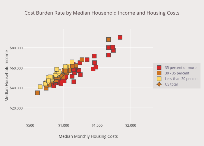
The relationship between cost burdens, incomes, and housing costs within the 100 most populous metro areas is illustrated in Figure 1. As the figure shows, while housing costs and household incomes tend to rise together, the trend in cost burdens is somewhat less straightforward. Metro areas with lower cost burden rates (less than 30 percent of households with cost burdens, shown in yellow) are largely those with both low median housing costs and low to moderate median household incomes. Metros with moderate cost burden rates (between 30 and 35 percent of households with cost burdens, shown in orange) are more likely to have wider income distributions and slightly higher median housing costs, so that housing affordability becomes more difficult for those at the lower end of the income spectrum. This is even more striking in the group of metros with high cost burden rates (35 percent or more of households with cost burdens, shown in red), which includes several of the highest-income and highest cost metro areas; in these, affordability challenges move up the income scale.

Figure 1 (move cursor over figure to access additional information)
Cost Burden Rate by Median Household Income and Housing Costs
Notes: Housing cost burdens are defined as housing costs of more than 30% of household income. Households with zero or negative income are assumed to have burdens, while renters paying no cash rent are assumed to be without burdens. Source: JCHS tabulations of US Census Bureau, 2013 American Community Survey.

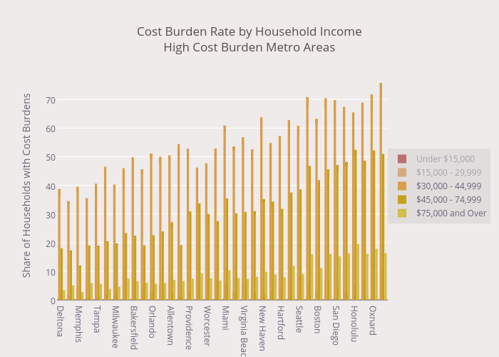
Indeed, cost burden rates among higher income groups rise dramatically as median housing costs rise (Figure 2). Among the large metro areas with the highest cost burden rates, the share of cost-burdened middle income households (with incomes between $30,000 and $45,000 annually) rises from just over one third in relatively low cost Tucson, to more than three quarters in high cost San Jose. A similar pattern holds among upper-middle and high income households, with cost burden rates topping 15 percent of high income households (earning more than $75,000 per year) in eight high cost metros.

Figure 2 (click on legend entry to display each income band)
Cost Burden Rate by Household Income<br>High Cost Burden Metro Areas<br><i>Click on legend entry to display each income band</i>
Notes: Housing cost burdens are defined as housing costs of more than 30% of household income. Households with zero or negative income are assumed to have burdens, while renters paying no cash rent are assumed to be without burdens. High cost burden metro areas have a metro-wide cost burden rate of 35 percent or more. Metro areas are ordered from lowest to highest median monthly housing costs. Source: JCHS tabulations of US Census Bureau, 2013 American Community Survey. 

The persistence of housing cost burdens among higher income groups illustrates the lack of affordable housing options for even those with considerable means in some of the country’s most vibrant metro areas. Even more troubling, however, is the near ubiquity of housing cost burdens among lower income households. As Figure 2 shows, cost burden rates top 80 percent among households earning less than $15,000 per year – about equivalent to full-time work at the federal minimum wage – in all higher burden metros, even those with lower median housing costs. Additionally, the national maps show that no less than half of all households earning under $15,000 per year are housing cost burdened in every metro and micro area in the country, regardless of how low median housing costs fall.

The immense challenge faced by low-income households in finding affordable housing has been intensively detailed in a number of other analyses. In its annual Out of Reach report, the National Low Income Housing Coalition concludes that a full-time minimum wage worker cannot afford to rent a one- or two-bedroom apartment at Fair Market Rent in any state in the country, while the Urban Institute has mapped the growing shortage of units adequate, affordable, and available to lowest income renters in counties nationwide. As each of these inquiries shows, housing affordability remains a compelling need for the nation’s lowest income households.

Thursday, September 3, 2015

How Much of the Damaged Housing Stock Was Rebuilt After Hurricanes Katrina and Rita?

by Jon Spader
Senior Research Associate
Ten years ago, Hurricanes Katrina and Rita created unprecedented damage in communities along the Gulf Coast. In addition to the human toll of the storms, the physical damage to the housing stock left many residents without a home to return to. On the 10th anniversary, we now have a clearer picture of the extent to which homes damaged by the storms were eventually repaired or replaced with a new home.

In the months following the storms, FEMA conducted extensive damage assessments of residential properties to estimate the amount of damage that occurred during the storm. (While the FEMA assessment data are not exhaustive of every property that experienced hurricane damage following Hurricane Katrina, they are the most comprehensive source of information on damaged units.) In early 2010, a second assessment was conducted on a representative sample of these properties using a structured observation method, in which observers working from the street or sidewalk identified repair needs associated with hurricane damage, such as missing shingles and observable flood lines. Figure 1 shows the results of these observations for properties that experienced at least $5,200 in damage, the standard FEMA used to define “major” damage.

Notes: Estimates are representative of 1-4 unit residential properties that experienced more than $5,200 in damage from Hurricane Katrina or Rita. Source: Analysis of property observation data collected by Abt Associates.

These observations show that 17 percent of properties continued to show visible damage more than 4 years after the storm. A property was categorized as a ‘damaged structure’ if it showed one or more observable repair need and the observer did not deem the overall condition of the property to be good or excellent. Almost half of the properties still showing visible signs of hurricane damage (8 percent of all observed properties) contained structures that did not meet the Census definition for a ‘habitable’ structure. Under this definition, a housing unit need only be closed to the elements with an intact roof, windows, and doors, and no posted sign or other evidence that the property is to be condemned or demolished. The remaining properties contain a combination of rebuilt structures (70 percent) and cleared lots (13 percent).

Beyond these overall rebuilding rates, the data reveal clear differences in rebuilding outcomes across geographies and by tenure status. First, substantial variation exists in the percent of rebuilt properties across parishes, counties, and other subgeographies, ranging from 42 percent in MidCity Planning District to 96 percent in Jefferson Parish. These differences reflect a number of factors, including variation in the initial severity of damage and the resources available to residents to support rebuilding.

Within these geographies, properties occupied by homeowners had consistently higher rates of rebuilding than rental properties (Figure 2). Interpreting these differences is complicated by underlying differences in the siting, insurance coverage, and owner resources of homeowner and small rental properties. Nonetheless, some portion of the differences is likely attributable to the prioritization of homeowners in the programs established for providing rebuilding assistance. For example, in Louisiana, 59 percent of homeowner properties with major damage received Road Home rebuilding grants, compared to only 12 percent of rental properties. The average amount of the rebuilding grants provided to homeowners was $77,010. A more complete discussion of these programs and the allocation of rebuilding assistance is available in Turnham et.al. (2010).


The set of properties with damaged structures is also not evenly distributed across neighborhoods or properties. Instead, properties with remaining damage were frequently clustered together on blocks where at least one property contained a rebuilt structure. Sixty percent of owner-occupied properties with remaining damage—and 76 percent of rental properties with remaining damage—had a damaged structure on at least one of the two nearest properties on their block that also experienced hurricane damage. Yet very few damaged structures appeared on blocks that had been largely abandoned, containing only damaged structures or cleared lots. The resulting image is one of clustered pockets of remaining damage scattered among properties where other property owners returned to rebuild.

Taken together, these rebuilding outcomes highlight the extent of sustained damage more than four years after the storms. Today, it has been another five plus years since the property observations were conducted, so another round of observations might provide useful information about whether the damage remaining in 2010 was eventually resolved or whether it continues to appear on these structures today. In the interim, these estimates provide useful insight into the reconstruction of the housing stock following Hurricanes Katrina and Rita. More information is provided in Spader and Turnham (2014) and in an article in the forthcoming issue of Cityscape titled “Will My Neighbors Rebuild? Rebuilding Outcomes and Remaining Damage following Hurricanes Katrina and Rita.”