Showing posts with label recovery. Show all posts

Monday, May 7, 2018

Leveraging Resiliency to Promote Equity

by David Luberoff
Deputy Director
Faced with the increased threat of natural disasters, some community-based organizations are trying to link their efforts to better plan for catastrophic events with their existing efforts to address issues like affordable housing and economic development, according to "Bounce Forward, Not Back: Leveraging Resiliency to Promote Equity," a new working paper jointly published by the Joint Center for Housing Studies and NeighborWorks® America. Written by Caroline Lauer, a master in urban planning student at Harvard's Graduate School of Design who was a 2017 Edward M. Gramlich Fellow in Community and Economic Development, the paper draws lessons from the growing literature on resiliency and from two case studies of notable initiatives carried out by organizations in NeighborWorks' national network of independent, nonprofit organizations focused on affordable housing and community development.

A sample RAPIDO home.

The first case study describes work done by the Community Development Corporation Brownsville, which has worked with several other community groups to develop RAPIDO, a holistic approach to disaster recovery that, "aims to quickly and affordably rehouse individuals and families, building social capital within the community, and stimulating the local economy." The key to this effort, Lauer explains, is providing families with, "a simple 480-square-foot [structure] that contains essential facilities," and training a group of "Navigators" who can lead residents through the disaster recovery process. The units, which cost about as much as the temporary manufactured units typically provided to people who have lost their home to natural disaster, "can be built easily at local lumberyards, transported by basic trailers, and assembled on-site in three days by four people." Moreover, unlike the temporary housing, the units are permanent and can later be expanded.

The second case study focuses on NeighborWorks® Umpqua's Southwestern Oregon Food System Collaborative (SWOFSC) Seafood Project, a multi-faceted effort to address the struggles of the region's small-scale fisheries. This effort does so by investing in and fostering local processing facilities and other infrastructure to support local fishermen. At the same time, it also uses marketing and other strategies to increase the local and regional demand for less traditional types of seafood that, because of warming oceans, comprise increasingly large shares of what local fishermen are bringing into port. Moreover, the project leveraged these economic development initiatives to help the region prepare for both slow-moving disasters, such as the effect of climate change on the fish population, and for acute disasters, such as a storms, tsunami, or earthquakes that might reduce or even cut off the region's access to the mainland for an extended period of time.

Although the initiatives are quite different, and while it is too soon to fully gauge their effectiveness, Lauer contends that together they offer three important and timely lessons given the hurricanes that hit Texas and Puerto Rico and the wildfires that devastated parts of California and other western states last year (after she had carried out her research). First, their differing trajectories show that while efforts to link community and economic development initiatives with projects that are focused on resiliency and disaster response can have different starting points and program structures, they can still achieve similar goals. Second, both show that regardless of how they start and are structured, such efforts should focus on creating social and physical connections and structures that can be used to address a variety of pre- and post-disaster conditions, including structural inequality. Finally, she notes, such efforts strengthen a community's ability to respond not only to anticipated problems but to unforeseen challenges and potential disasters.

Wednesday, November 2, 2016

When Boundaries Matter: Counties, Census Tracts, and Anti-Poverty Programs

by Sonali Mathur
Research Assistant
Recent discussions about potential federal anti-poverty programs underscore that seemingly mundane choices about geographic units could have important impacts on how available funds are distributed.

In a recent New York Times op-ed, Hillary Clinton asserted that if elected, she would develop an anti-poverty strategy modeled on the “10-20-30” approach put forward by Congressman James Clyburn (D-South Carolina), the number three Democrat in the House.

Initially proposed during the drafting of the American Reinvestment and Recovery Act, the 10-20-30 approach called for 10 percent of funds of federal programs subject to this plan be directed to persistent poverty counties where at least 20 percent of the population has been living in poverty for 30 years.

While this may have worked for the original intent of appropriately directing the rural development funds, the county based approach may not necessarily work across a wider range of programs and may not be the right approach to address extreme poverty.

While most discussion about the anti-poverty proposal has been focused on the money that would be made available, the geographic level used to allocate funds – be it counties, neighborhoods or something else – will significantly affect where the money would be spent and who would benefit from it.

Most notably, basing the selection criteria at the county level would tend to allocate money mostly to rural parts of the United States. Shown below is the map of persistent poverty counties (defined as any county that has had 20 percent or more of its population living in poverty in the 1990, 2000 and 2010 decennial censuses).

 Click to enlarge
Source: JCHS tabulations of decennial census and American Community Survey 2006-2010 
Note: The exact list of eligible counties may vary based on the data source used. The choice of American Community Survey data (ACS) 2006-2010, ACS2007-2011 or Census bureau’s small area estimates results in the difference.

The county-based approach results in a majority of persistent-poverty areas being rural counties spread across 30 states; (85 percent of these counties are in non-metropolitan areas) and this approach excludes many areas of extreme poverty in inner cities of urbanized areas such as Los Angeles (Los Angeles County), Detroit (Wayne County), Chicago (Cook County), Dallas-Fort Worth (Dallas and Tarrant Counties), Newark (Essex County, New Jersey) and the District of Columbia.

In comparison, when applied at the census tract level, which is a much smaller geography than a county, the 20-30 rule yields a much broader array of urban, suburban, and rural communities of extreme poverty with a broader representation across states. At the census tract level, at least one persistent-poverty tract appears in each of the 50 states and in DC. In all, the tract-level application results in a total of 8,472 persistent-poverty tracts, which together are home to 30.7 million people (ACS 2010-2014). Only about 8.5 of these people are in persistent poverty counties. This implies that the county-level application of the 10-20-30 rule would exclude nearly 22.2 million people who live in persistent-poverty census tracts that are not in persistent-poverty counties.

Click image to launch interactive map. Please note: Maps may take a moment to fully render.
 Click to go to interactive map

Yet another layer of complexity arises when you consider the many areas where at least 40 percent of the population is in poverty but have not had high poverty rates for the last three decades. These areas include 776 census tracts that are home to 2.8 million people, (ACS 2010-2014) that are not persistent-poverty tracts. Moreover, approximately 10.8 million people live in census tracts where at least 40 percent of the population is in poverty but the county is not considered a persistent-poverty area. Including these areas in anti-poverty efforts is important because numerous studies, including Harvard University’s Equality of Opportunity Project, have shown that concentration of poverty amplifies the adverse effects of poverty, as individuals deal not only with their own poverty but of those around them as well.

In short, the application of the 10-20-30 rule at the county level would exclude the vast majority of poor people who live in urban and suburban census tracts that are in persistent poverty. Additionally, focusing on persistent poverty tracts alone would exclude some areas that currently face concentrated poverty but may not fit the definition of persistent poverty.

It should be noted that Clinton’s op-ed used the term 'communities' instead of 'counties' perhaps signaling that her application of the rule might be at a smaller geography than counties. Although, there have been other reports where she has been quoted to show support for Clyburn’s original formula with the use of the term 'counties', and it also appears that the formula has made its way into several congressional proposals, which makes it imperative to discuss the geography of its application.

Thursday, October 6, 2016

Housing Recovery by Income in Two Metros: San Francisco and St. Louis

by Alex Hermann
Research Assistant
The increases in home prices that have occurred since the Great Recession not only vary across the nation’s metropolitan areas, they also vary within many metros as well. The San Francisco metropolitan area, where home values are now 16 percent above their pre-recession peak, and the St. Louis metropolitan area, where home values are still 10 percent below their pre-recession peak, illustrate these variations.

In both areas, median home prices in low-income ZIP Codes are less likely to exceed mid-2000 peaks than median prices in high- and moderate-income ZIPs. However, the regions vary when looking at the changes in house prices between 2000 and 2016. Over that time period, the percentage increase in median prices in the Bay Area’s low-income ZIPs was greater than the increases in high- and moderate-income ones. In contrast, the percentage increase in St. Louis’ low-income ZIP Codes was much smaller than the increase in that region’s high- and moderate-income ZIP Codes. (In this analysis, low-, moderate-, and high-income ZIP Codes have a median household income under 80 percent, between 80 and 120 percent, and above 120 percent of their state’s median income, respectively.)

Changes in home price also vary within both metros. For example, metropolitan San Francisco has had the eighth strongest post-recession recovery in home prices. As a result, median home values in San Francisco’s high-income ZIP Codes are about $1.18 million dollars while the median value in low-income ones are $586,000, more than three times the median price for the U.S. as a whole, which is $186,500.

However, home values in many of the region’s ZIP Codes are still below their pre-recession peak (Figure 1). In all, 31 of San Francisco’s 142 ZIPs, or 22 percent, have yet to regain their mid-2000 peaks, including:

  • 50 percent (5 of 10) of low-income ZIPs
  • 35 percent (12 of 34) of moderate-income ZIPs, and
  • 14 percent (14 of 98) of high-income ZIPs.

 Click to enlarge
Source: JCHS tabulations of Zillow Home Value Index data and ACS 2014 5-year data

Most ZIP Codes that have not regained their peak median home values are located on the outskirts of Metro San Francisco, particularly in northern Contra Costa County. That area is home to 10 of the 14 high-income ZIP Codes where median prices have not exceeded their pre-recession peak as well as 8 of the 12 moderate-income ones and three of the five low-income ones. Most of the remaining ZIP Codes where prices are still below pre-recession peaks are in the urban areas south of Oakland along the East Bay, which includes many low and moderate-income ZIP Codes as well as two high-income ones.

Although prices in San Francisco’s low-income ZIP Codes are less likely to regain their pre-recession peaks, the trend is different when examining price changes since 2000. Overall, home values increased in all the region’s ZIP Codes. But on a percentage basis, the values in low-income ZIP Codes increased more rapidly than those in high-income areas (Figure 2).

 Click to enlarge
JCHS tabulations of Zillow Home Value Index data and ACS 2014 5-year data

The story is somewhat different in metropolitan areas that have not seen San Francisco’s rapid price appreciation, such as St. Louis, where home values in June 2016 were still 10 percent below their pre-recession peak. There, median prices exceeded their peaks in only 27 of 147 ZIP Codes, most of them located in the region’s urban core and suburban Madison County. (Figure 3). These unrecovered areas include:

  • 1 of 35 (3 percent) low-income ZIPs
  • 6 of 55 (11 percent) moderate-income ZIPs, and
  • 20 of 57 (35 percent) high-income ZIPs.

 Click to enlarge
JCHS tabulations of Zillow Home Value Index data and ACS 2014 5-year data

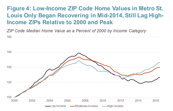
Moreover, unlike San Francisco, prices in low-income ZIP Codes in St. Louis have grown only modestly since 2000 and have increased much less than those in high- and moderate-income ZIP Codes. In the run-up to peak, prices in low-income ZIP Codes grew only marginally faster than prices in high-income ZIPs. Additionally, the post-recession upturn in home values in low-income ZIPs lagged the increase in high-income ZIP Codes by nearly two years (Figure 4).

 Click to enlarge
JCHS tabulations of Zillow Home Value Index data and ACS 2014 5-year data

What to take away from this analysis? Overall, home values in high-income ZIP Codes have outpaced home-value gains in low-income ZIPs since the price peak of the mid-2000s. When taking a broader view, low-income ZIP Codes have performed as well as high-income ZIPs since 2000 in fast-appreciating markets like San Francisco, while in many lagging markets, like St. Louis, home value gains in high-income ZIPs have typically surpassed those in low-income ZIPs. Furthermore, though income levels are important they are not determinative. The geographic patterns also underscore the fact that trends in home values are also a function of features such as density and proximity to the central city.

These relationships, and others, will be discussed in a forthcoming Joint Center working paper on home value trends since 2000.

Tuesday, September 27, 2016

High-Income ZIP Codes Benefit Most from Housing Recovery

by Alexander Hermann
Research Assistant
Although home prices nationally have been on the upswing since early 2012, the increases have not only been uneven across metropolitan areas but are more likely to have occurred in the most affluent parts of each metropolitan area, according to a new Joint Center analysis of Zillow home value data.

Most notably, home values in high-income ZIP Codes that are home to their region’s more affluent residents are now about 1 percent higher than their post-2005 peak, while values in low-income ZIP Codes—which increased dramatically in the early 2000s—are still about 12 percent below their pre-recession peak. Moreover, home values in moderate-income ZIP Codes are still about six percent below their pre-recession peak (Figure 1). (In this analysis, low, moderate, and high-income ZIP Codes have a median household income less than 80 percent, between 80 and 120 percent, and above 120 percent of the state median income, respectively.)

Source: JCHS tabulations of Zillow Home Value Index data and ACS 2014 5-year data.

Moreover, home prices in low-income ZIP Codes are lagging both in recovered metropolitan areas as well as in metros yet to regain their peak price. Specifically, in recovered metros, 83 percent of high-income and only 65 percent of low-income ZIP Codes had median home values matching or exceeding their peak, a full 18-point difference. In metro areas within 15 percent of peak, but still below, 22 percent of high-income ZIP Codes have recovered relative to 9 percent of low-income ZIP Codes. In metropolitan areas furthest from peak—by one measure, those that remain hardest hit—only a sliver of low-income ZIPs (5 of 699) have recovered, compared with 37 of 899 high-income ZIP Codes (4 percent). In total, across the nation, 37 percent of high-income ZIP Codes have recovered, versus only 23 percent of low-income ZIP Codes (Figure 2).

Source: JCHS tabulations of Zillow Home Value Index data and ACS 2014 5-year data.

Extending the analysis to 2000 demonstrates why high-income ZIP Codes have been more likely to recover. Low-income ZIP Code home values increased tremendously during the housing boom, but a similarly harsh decline has made recovery more difficult, and has significantly weakened low-income ZIP Code home value gains since 2000 relative to high-income ZIPs. At peak, the median home value in low-income ZIP Codes more than doubled (increasing 101 percent) from January 2000 (Figure 3). The peak median value in high-income ZIP Codes increased only 82 percent. However, the post-recession decline wiped out a large share of the relative gains low-income ZIP Codes had made. In these ZIPs, median home values (as a percent of the January 2000 home value) dropped nearly 65 percent. In high-income ZIP Codes, the drop was 38 points. This precipitous decline, and a lagging recovery, have given high-income ZIPs a narrow edge in median home value increases overall. As of June 2016, median home values in high and low-income ZIPs were 84 and 76 percent, respectively, above their 2000 median home value.

Source: JCHS tabulations of Zillow Home Value Index data and ACS 2014 5-year data.

The overall trend varies somewhat when breaking ZIP Codes down into recovered and unrecovered metros. In recovered metros, median home value gains in high-income ZIP Codes have steadily outpaced those in low-income metros over time, sharply accelerating during the recovery (Figure 4). In unrecovered metros (which include nearly 70 percent of ZIP Codes in our sample), home values in low and high-income ZIP Codes have drawn about even in the long run (Figure 5). Figure 5 also shows that the metros worse off relative to past peaks are those where low-income ZIPs saw substantial home value gains relative to their initial home value and large declines during the recession. In these unrecovered metros, ZIP Codes in both categories have median home values about 79 percent above their 2000 values.

Source: JCHS tabulations of Zillow Home Value Index data and ACS 2014 5-year data.

Note: Percentage growth derived from nominal dollars.
Source: JCHS tabulations of Zillow Home Value Index data and ACS 2014 5-year data.

In an upcoming post, we’ll take a closer look one US metro that illustrates the uneven price recovery within its own ZIP Codes – San Francisco.

Thursday, September 22, 2016

New Data Shows US Renter Cost Burdens Easing, But Still Elevated

by Dan McCue
Senior Research
Associate
The number of renters paying 30 percent or more of their income on housing decreased in 2015 by 240,000 households, reversing an eight-year trend of annual increases in the number of “cost-burdened” renters, according to new data released last week by the US Census Bureau. Unfortunately, however, the decrease was very modest in comparison to previous years. Indeed, the decrease in rent-burdened households recorded in 2015 was less than half the increase recorded in 2014. Moreover, the data show that there still are 21.4 million “cost-burdened” renters in 2015, 1.15 million more than in 2010 and fully 4.0 million more than in 2005 (Figure 1).

 Click to enlarge
Source: JCHS tabulations of US Census Bureau, 2015 1-Year American Community Survey estimates via FactFinder

The data also show some improvement in the number and share of “severely burdened” renters (those paying 50 percent or more of their income on rent). However, this growth was not enough to return to the pre-recession levels of 2008 and earlier. Overall, the number of renters paying 50 percent or more on rents decreased from 11.50 million to 11.28 million in 2014–2015, which was the lowest number since 2010. The share of renters with severe burdens dropped from 26.6 percent of all renters in 2014 to 25.8 percent in 2015. This is the lowest rate recorded since 2008, when 25.0 percent of renters paid 50 percent or more of incomes on housing.

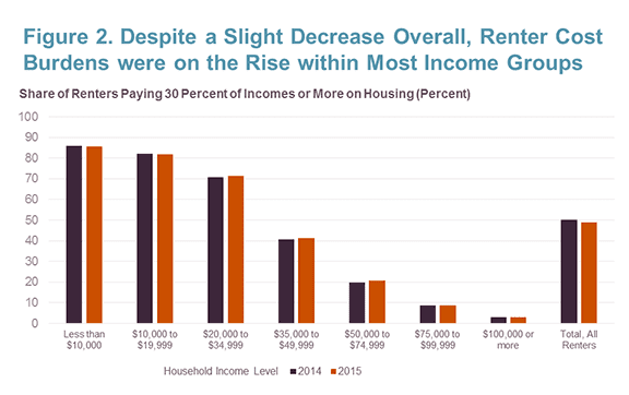
In addition, the decline in the overall number of cost-burdened renter households in 2015 masked some worsening of cost burden rates within many income groups (Figure 2). Among people earning $20,000-to-$34,999 annually (which in many areas is still a low and/or moderate income), the share of those who were cost-burdened rose from 70.8 percent in 2014 to 71.3 percent in 2015. While a much smaller share of renters making more than $35,000 a year are cost-burdened, there were modest (less than one-percentage point) increases in the share of cost-burdened households, for these renters as well. In comparison, while more than 80 percent of the renters who make less than $20,000 a year are cost-burdened, that figure fell by less than one percent between 2014 and 2015.

 Click to enlarge
Source: JCHS tabulations of US Census Bureau, 2014 and 2015 1-Year ACS data.

Taken together, these shifts suggest that the overall decline in cost-burden rates for renters is due to growth in the number of renters with higher incomes and a decline in the number of low-income renters. While this could be viewed as a positive trend for renter households as a group, the fact that renter burden rates continue to grow within and among higher income groups suggests affordability problems are growing across the income spectrum and even for higher income groups.

Tomorrow, we’ll take a closer look at the improvement trends across various metropolitan areas.

Wednesday, December 2, 2015

CDFI Cluster Demonstration Project

Alexander Von Hoffman
Senior Research Fellow
In December 2013 the JPMorgan Chase Global Philanthropy Foundation issued a call for proposals for groups of Community Development Financial Institutions (CDFIs) to coordinate financial programs to alleviate problems facing low- and moderate-income communities, small businesses, and individuals. In January 2014 the foundation announced awards, totaling $33 million over a three-year period, to seven CDFI collaboratives. At the request of JPMorgan Chase Global Philanthropy, Alexander von Hoffman profiled the characteristics, objectives, methods, and achievements of each of the CDFI collaboratives in the first phases of their work. 

Purpose and Problems of CDFIs

In working- and lower-class neighborhoods in the United States, stability, let alone opportunity, is hard to come by. It can be difficult to get a loan on fair terms to buy a house or expand a business, particularly where African Americans, Hispanic Americans, and immigrants live. In such areas, there is often no transportation to school, jobs, and shops. In some places a store with the necessity of life – food – is nowhere to be found.

Yet conventional banks are often reluctant to make loans for such specialized and sometimes risky purposes. Fortunately, in recent years, federally funded nonprofit lending organizations – known officially as community development financial institutions or CDFIs – have moved in to fill the gap in credit for these needs.

CDFIs are engaged in a demanding business. Their customers may be inexperienced in formal banking or have challenging circumstances – such as a recent home foreclosure, the launch of a new and untested business venture, or even the lack of legal citizenship status.

To provide credit in such situations requires that CDFI officers learn about their clients’ situation and craft appropriate solutions. They might have to customize a loan product or provide personal technical assistance. In more extreme cases, CDFI officers may have to seek out and educate people about the benefits of proper credit.

Given the nature of CDFIs’ business, many of them find it difficult to provide credit on a scale large enough to make a visible impact on low-income communities. Low balance-sheets, lack of operating capital, and insufficient revenue streams can prevent CDFIs from increasing lending activities or expanding their service areas geographically.

Successful CDFIs have found that one of the best ways to overcome these obstacles is to collaborate with other CDFIs.

The First Round of PRO Neighborhoods Awards

To jumpstart collaborations among CDFIs, in January 2014 JP Morgan Chase Global Philanthropy Foundation awarded seven CDFI collaborative clusters, including twenty-seven CDFIs doing widely different work in diverse locales. In the first phase of the foundation’s PRO Neighborhoods program (Partnerships for Raising Opportunity in Neighborhoods) these grants totaled $33 million over a three-year period.

Although the grant period has more than a year to run, our initial evaluation shows the awards have had a striking effect both on the ground and on the CDFIs themselves.

The award capital and its leveraged investment have helped CDFIs strengthen their balance sheets immensely. The seven collaborative clusters have so far raised more than $226 million, or almost seven times the original amount, to carry out their community development programs.

CDFI members of the clusters have ramped up scale of production and expanded their reach across new geographies and types of customers. They have also devised new methods of communication and lending practices suited to the oft-neglected needs of low-income clients.

The CDFI clusters have undertaken a remarkably wide variety of endeavors, including lending to small businesses that are minority-owned or in low-income neighborhoods, helping mobile-home owners purchase and manage their communities, increasing the provision of fresh healthy food, aiding and financing the minority and immigrant owners of low-rent apartment buildings in Chicago, and generating equitable transit-oriented development in the poor and working-class Latino neighborhoods of Phoenix.

The process of collaborating itself helped boost the participating CDFIs. By meeting, discussing, and coordinating with one another, leaders and staff members learned about obstacles in the field, ways to mesh business cultures, and best practices to achieve their desired results.

Having made a great impact on low-income communities and numerous CDFIs that serve such communities, the first round of the PRO Neighborhoods awards has demonstrated that funding CDFI collaborations can be an effective way to support a wide array of underserved populations. Furthermore, the awards is project has helped to lay the foundations for the growth of these CDFIs that will allow them to expand their programs into the future.

Friday, October 23, 2015

Variable Population Growth is Driving an Uneven Housing Recovery in the Nation’s Large Metropolitan Areas

by George Masnick
Senior Research Fellow
We easily accept the proposition that the housing recovery will be greatest in parts of the country where population growth and job growth are occurring more rapidly. But we often forget that the longer-term trends in population growth that drive housing demand are not only highly variable across metropolitan areas, but also tend to be persistent over time within metros. Places leading the housing recovery are the same places where the engines of population growth have had the greatest long-term sustained horsepower. These are places where the young adult population is growing most rapidly. Such places have younger age structures because they are destinations for both international and domestic migration, and their younger age structures sustain population growth from higher natural increase as well. Slow growth metros, where the demand for new housing is lower, are generally places with older age structures and a lack of net in-migration – places where these variables are not likely to change in a fundamental way in the foreseeable future. That being said, there have been changes in population growth among the nation’s large metros since the end of the Great Recession that are worth noting. Metros that have grown more slowly since before 2010 are still trying to put the effects of the economic downturn behind them. Metros that have higher population growth 2010-2014 are generally those where rising housing prices and rents have squeezed household budgets most severely.

The latest release of Census Bureau 2014 population estimates for metropolitan areas underscores the existence of large differences in population growth among the nation’s large metros. The nation’s 100 largest metropolitan areas in 2014 are home to about two thirds of Americans. The largest of these is the New York-Northern New Jersey-Long Island metro at just over 20 million, and the smallest is Durham-Chapel Hill at about 550,000. If we compare population growth that took place during the first decade of this century with what has occurred more recently, we can see both the longer-term growth differences among metros and identify places where population growth has accelerated or declined between 2010 and 2014.

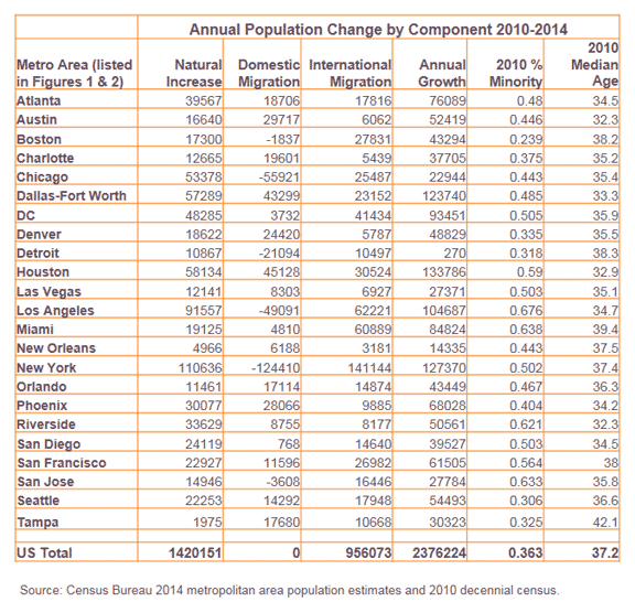
Figure 1 plots annual population growth in the 97 of the 100 largest metro areas in 2010 that also made this list in 2014. Most of the 97 metros cluster together at under 25,000 annual population growth for both periods, and are growing moderately, slowly, or not at all. Only a couple of dozen metros exhibit population growth that sets them apart. For these, the higher the population growth in 2000-2010, the higher the growth in 2010-2014. For example, the Houston-Sugarland-Baytown metro area added an average of 123,000 people per year in the decade 2000-2010 and 134,000 per year from 2010 to 2014. Dallas-Fort Worth-Arlington increased 126,000 annually during the 2000s and 124,000 annually so far this decade. New York-Northern New Jersey-Long Island grew at an annual rate of 124,000 during each period.

https://blogger.googleusercontent.com/img/b/R29vZ2xl/AVvXsEgYADZ5qn8CPCuBSAVXqeUbrWBTtrxZ7ShDBsOD1PHFC8HRiVTrC5il4H2QF25Z35Y0XQS4feWy8GhayVXhr-YFAjw77cpdYfxdCTIbdgUT-cgYEDXU2SJsr_77G7ZM-AHFMPR5SqW8DkMa/s1600/Masnick_fig1.PNG

The diagonal red line separates the scatterplot into metros that grew at a faster numerical annual rate during 2010-2014 compared to 2000-2010 (above the line) from those that grew more slowly (below the line). Among other moderately-higher growth metros, Atlanta-Sandy Springs-Marietta, Phoenix-Mesa-Scottsdale, Riverside-San Bernardino-Ontario, and Las Vegas-Paradise have grown more slowly since 2010, while Los Angeles-Long Beach-Santa Ana, the DC-VA-MD-WV metro, and Miami-Fort Lauderdale-West Palm Beach have grown more rapidly. Some metros with moderate growth during the previous decade have begun to grow more rapidly and add 30,000 or more people per year during the first half of the current decade. In addition to San Francisco-Oakland-Hayward and Boston-Cambridge-Quincy, Seattle-Tacoma-Belleview, Denver-Aurora-Lakewood, San Jose-Sunnyvale-Santa Clara and San Diego-Carlsbad are on this list of metros with significantly increased population growth. These are also places with the greatest increases in housing prices.

The Charlotte-Gastonia-Concord metropolitan area is an outlier in how much slower its population has grown in the recent period compared to 2000-2010. Such a slowdown should be surprising since Charlotte was not hit by the Great Recession and the bursting of the housing bubble as much as other metros falling well below the red line in Figure 1. In fact, its faster growth during 2000-2010 stems primarily from a large (+26%) adjustment to its baseline 2010 census count. It is the only metro in the top 100 with such a large percentage adjustment, which the Census Bureau states could be "due to legal boundary updates, other geographic program changes, and Count Question Resolution action."

Decomposing population growth into its two broad components, net migration and natural increase (excess of births over deaths), allows us to better understand these recent metropolitan population growth trends. Figure 2 shows that the greater the net migration the greater the natural increase. Since migrants are generally young adults, metros that are migrant destinations have a greater excess of births over deaths. This is especially true of metros like Houston-Sugarland-Baytown, Dallas-Fort Worth-Arlington, DC-VA-MD-WV and Atlanta-Sandy Springs-Marietta, where both domestic and international migration are strongly positive (Table 1). Places that are retirement destinations like Miami-Fort Lauderdale-West Palm Beach, Orlando-Kissimmee-Sanford, and especially Tampa-St. Petersburg-Clearwater, have much lower rates of natural increase (fewer births and more deaths) because of their older age structures.
https://blogger.googleusercontent.com/img/b/R29vZ2xl/AVvXsEhFeK4nTXZKN_TMCTkJIwRnktTNPc60bGU5m002VytkYwMpKLE2TdQio1nxeJ8B1sbl0Tj0QQLcBN5Ec4qr-R4Vx-iu7c3WX5YebDw5o0ERH24B8_dTr_VlJmsNFl6T-5NITGQqUtgSC6V3/s1600/Masnick_fig2.PNG

New York-Northern New Jersey-Long Island is an outlier, with its high level of international immigration largely being offset by domestic outmigration (annually 141,000 and -124,000 respectively during 2010-2014). But the New York metro’s high share of minority population (50.2 percent according to the 2010 census) produces a large growth from natural increase because of younger age structure and above-replacement fertility for minorities. Los Angeles-Long Beach-Santa Ana’s profile is similar to New York’s in that levels of recent annual international in-migration are offset by high levels of domestic migration losses (62,000 and -49,000 respectively), and its high natural increase is fueled by its minority population (67.6 percent in 2010). The Chicago-Naperville-Elgin metro area has recently experienced more than twice the level of domestic out-migration than immigration according to Census Bureau estimates. Still, Chicago’s minority population (46 percent in 2010) produces a significant level of natural increase, which has kept the Chicago metro’s overall population growth positive.

https://blogger.googleusercontent.com/img/b/R29vZ2xl/AVvXsEiNSPjt3PUBUGl6NAxXIn_1KullPPkQOvey0Mno2E3AUA43Ldt67saXAu9qe6qwxF2LIU9oIZdO57PEIvWKJSfOAfneqKVuzAnKOdXUKawulZ2F6fujbzZLWrFI8rnpGWAU9tZV50RJu9XE/s1600/Masnick_table1.PNG

Population age structure and percent minority are demographic characteristics that change little from year to year, and these are the characteristics that largely determine growth from natural increase. Places with high natural increase should continue to produce and excess of births over deaths. Looking forward, unless patterns of domestic or international migration change dramatically in the short run, high-growth metros should remain high and low-growth metros remain low.

Thursday, October 15, 2015

Remodeling Spending Expected to Accelerate into 2016

by Abbe Will
Research Analyst
After several quarters of slackening growth, home improvement spending is projected to pick-up pace moving into next year, according to the Leading Indicator of Remodeling Activity (LIRA) released today by the Remodeling Futures Program at the Joint Center for Housing Studies of Harvard University. The LIRA projects annual spending growth for home improvements will accelerate from 2.4% last quarter to 6.8% in the second quarter of 2016.

Home improvement spending continues to benefit from the last years’ upswing in housing market conditions, including new construction, price gains, and sales. Strengthening housing market conditions are encouraging owners to invest in more discretionary home improvements, such as kitchen and bath remodeling and room additions, in addition to the necessary replacements of worn components such as roofing and siding.

Although we expect remodeling activity to strengthen through the first half of 2016, further gains could be tempered. Current slowdowns in shipments of building materials and remodeling contractor employment trends, as well as restrictive consumer lending environments, are lowering remodeler sentiment and could keep spending gains in the mid-single digit range moving forward.

https://blogger.googleusercontent.com/img/b/R29vZ2xl/AVvXsEhw-cwzT8MGXfYnhnP9c1NuAV5pQf6lhARx-Bd02NOvgT5jUrgIMiPBeCp9fkGh2X-nuTD2T5AcoI27iojMVOjDANi8sAYmWSppWvlW650x_1qVJBE-TQ6Im4cvz-h4S1ZnnYLfKWeY8XZ_/s1600/lira_2015_q3_fullsize_jchs.PNG
--
The Leading Indicator of Remodeling Activity (LIRA) is designed to estimate national homeowner spending on improvements for the current quarter and subsequent three quarters. For more information about the LIRA, including how it is calculated, please visit the LIRA page on the Joint Center’s website. The LIRA is released by the Remodeling Futures Program at the Joint Center for Housing Studies in the third week after each quarter’s closing.

Friday, September 18, 2015

Where Are All the Homes? Demographic Underpinnings of the Lack of For-Sale Inventory

by Dan McCue
Senior Research Associate
One of the challenges faced by housing markets has been a persistent lack of inventory of homes for-sale. Indeed, the most recent data on existing home sales from the National Association of Realtors® show that for 37 months we’ve been in a seller’s market – traditionally defined as a market in which there is less than six months’ supply of homes listed for sale (Figure 1). And, according to Redfin, this year’s spring buying season saw inventory nationwide hit record lows (see June Housing Markets Sets All-Time Records for High Speed and Low Supply).  In the many markets with few homes available for sale, new listings are almost immediately snatched up, with the high competition among buyers pushing prices out of reach of a growing number of would-be homeowners.    

Note: Data include existing single-family, condo, and co-op units for sale. Annual data are seasonally adjusted monthly averages. 2015 data are year-to-date through July. Source: National Association of Realtors®, Existing Home Sales via Moody’s Analytics.

There are several possible explanations commonly mentioned as to why for-sale inventories remain so tight, including the large number of owners stuck in homes because they are ‘underwater’ on their mortgages, the still-elevated volume of homes in the foreclosure process and held off the market, the lack of new construction in the years following the housing boom, and the many single-family units that have been taken out of the for-sale market to become rentals. But one additional reason not often discussed is demographics, which has also been playing a role in both the lack of inventory and in the slowness in new home sales over the past several years. Indeed, the ongoing generational shift among American households has slowed sales in the short run and is likely to continue to dampen sales over the next two decades.

Demographics and the Reduced Pool of Active Trade-up Homeowners

Over the past ten years, members of generation-X aged into the 30- and 40- year old age groups (Figure 2). As this relatively small generation, once called the baby-bust, replaced the large baby-boom generation now in their 50s and 60s, the population in their 30s and 40s declined. In some cases, the declines were stark. For instance, for the 35-39 year old age group, the population in 2013 was 9.3 percent smaller than it was 10 years earlier, with 10.4 percent fewer households.

Source: JCHS tabulations of US Census Bureau, Population Projections.

At the same time, as the 2015 State of the Nation’s Housing report mentions, the US homeownership rate took a significant dive, dropping to levels not seen in 20 years, with outsized declines among some age groups and the sharpest drop occurring among 35-44 year olds. Indeed, despite all the attention given millennials, homeownership rates among gen-Xers – particularly those currently age 35-44 – are actually furthest below 20-year historical rates of similarly aged adults (Figure 3).

Source: JCHS tabulations of US Census Bureau, Housing Vacancy Surveys.

So in combination, the demographically-driven decline in population of 30- and 40 year-olds was magnified by a sharp drop in homeownership rates, resulting in a significant decline in the number of homeowner households at these ages. Among the 35-39 year old age group, for instance, the number of homeowner households dropped fully 23 percent between 2003 and 13, and among 40-44 year-olds the decline was a substantial 19 percent (Figure 4)

Source: JCHS tabulations of US Census Bureau, Current Population Surveys.

Traditionally, the 30s and 40s are key ages for housing market activity – particularly for trade-up and new home purchases. Indeed, homeowners aged 35-44 historically make up the majority of trade-up buyers (Figure 5). Fewer current homeowners in this key age group has meant fewer potential trade-up buyers and sellers, meaning fewer people putting their homes on the market, adding to tight inventories of for-sale homes. 

Source: JCHS Tabulations of American Housing Survey data.


Source: JCHS Tabulations of American Housing Survey data. 

Additionally, one of the most common ownership opportunities desired by trade-up buyers is a new home. Indeed, 35-44 year olds are also typically responsible for a high share of new home sales (Figure 6). And the majority of new homes sales to this age group are to those who are currently homeowners, so fewer current owners in this age group has also meant fewer potential buyers of new homes, fewer new home sales, and therefore a sizeable headwind to single family homebuilding. And there are other implications as well, such as for home improvements spending, given that most movers do some kind of post-move improvements, even if it’s just painting the walls, so fewer sales among gen-X has also affected remodeling spending markets as well.

Source: JCHS Tabulations of American Housing Survey data. 

While the millennials and baby boomers attract most of the headlines about how demographic trends are influencing housing demand, gen-X ers may actually be more influential than they get credit for in contributing to the recent weakness in single-family construction, home re-sales activity, and the widespread lack of inventory in many markets. 

One final note, however, is that the aging of the baby boom generation may also be contributing to the low levels of inventory and slower home sales – and this contribution may be a longer-lasting trend than that of the gen-X discussed above. Since mobility rates decline with age, the aging of the baby-boom will mean increasingly higher shares of older households who move less frequently. While there are concerns, most notably expressed in Dowell Myers’ insightful book Immigrantsand Boomers, regarding the potential future problem of elderly baby-boomers unloading a glut of housing on the market as they sell off or otherwise cease to head their own households, the oldest boomers are still only in their late 60s and so mostly many years from exiting the housing scene. And if for-sale inventories continue to remain tight as they are today, we may need to worry about the opposite problem: not enough turnover in the housing market to meet the needs of younger households, at least until boomers do reach the ages when they begin to vacate their homes in significant numbers. At present, it’s still hard to tell how much of the currently tight inventory is due to lingering effects of the housing downturn from longer term demographic shifts. Time will tell.  

Thursday, September 3, 2015

How Much of the Damaged Housing Stock Was Rebuilt After Hurricanes Katrina and Rita?

by Jon Spader
Senior Research Associate
Ten years ago, Hurricanes Katrina and Rita created unprecedented damage in communities along the Gulf Coast. In addition to the human toll of the storms, the physical damage to the housing stock left many residents without a home to return to. On the 10th anniversary, we now have a clearer picture of the extent to which homes damaged by the storms were eventually repaired or replaced with a new home.

In the months following the storms, FEMA conducted extensive damage assessments of residential properties to estimate the amount of damage that occurred during the storm. (While the FEMA assessment data are not exhaustive of every property that experienced hurricane damage following Hurricane Katrina, they are the most comprehensive source of information on damaged units.) In early 2010, a second assessment was conducted on a representative sample of these properties using a structured observation method, in which observers working from the street or sidewalk identified repair needs associated with hurricane damage, such as missing shingles and observable flood lines. Figure 1 shows the results of these observations for properties that experienced at least $5,200 in damage, the standard FEMA used to define “major” damage.

Notes: Estimates are representative of 1-4 unit residential properties that experienced more than $5,200 in damage from Hurricane Katrina or Rita. Source: Analysis of property observation data collected by Abt Associates.

These observations show that 17 percent of properties continued to show visible damage more than 4 years after the storm. A property was categorized as a ‘damaged structure’ if it showed one or more observable repair need and the observer did not deem the overall condition of the property to be good or excellent. Almost half of the properties still showing visible signs of hurricane damage (8 percent of all observed properties) contained structures that did not meet the Census definition for a ‘habitable’ structure. Under this definition, a housing unit need only be closed to the elements with an intact roof, windows, and doors, and no posted sign or other evidence that the property is to be condemned or demolished. The remaining properties contain a combination of rebuilt structures (70 percent) and cleared lots (13 percent).

Beyond these overall rebuilding rates, the data reveal clear differences in rebuilding outcomes across geographies and by tenure status. First, substantial variation exists in the percent of rebuilt properties across parishes, counties, and other subgeographies, ranging from 42 percent in MidCity Planning District to 96 percent in Jefferson Parish. These differences reflect a number of factors, including variation in the initial severity of damage and the resources available to residents to support rebuilding.

Within these geographies, properties occupied by homeowners had consistently higher rates of rebuilding than rental properties (Figure 2). Interpreting these differences is complicated by underlying differences in the siting, insurance coverage, and owner resources of homeowner and small rental properties. Nonetheless, some portion of the differences is likely attributable to the prioritization of homeowners in the programs established for providing rebuilding assistance. For example, in Louisiana, 59 percent of homeowner properties with major damage received Road Home rebuilding grants, compared to only 12 percent of rental properties. The average amount of the rebuilding grants provided to homeowners was $77,010. A more complete discussion of these programs and the allocation of rebuilding assistance is available in Turnham et.al. (2010).


The set of properties with damaged structures is also not evenly distributed across neighborhoods or properties. Instead, properties with remaining damage were frequently clustered together on blocks where at least one property contained a rebuilt structure. Sixty percent of owner-occupied properties with remaining damage—and 76 percent of rental properties with remaining damage—had a damaged structure on at least one of the two nearest properties on their block that also experienced hurricane damage. Yet very few damaged structures appeared on blocks that had been largely abandoned, containing only damaged structures or cleared lots. The resulting image is one of clustered pockets of remaining damage scattered among properties where other property owners returned to rebuild.

Taken together, these rebuilding outcomes highlight the extent of sustained damage more than four years after the storms. Today, it has been another five plus years since the property observations were conducted, so another round of observations might provide useful information about whether the damage remaining in 2010 was eventually resolved or whether it continues to appear on these structures today. In the interim, these estimates provide useful insight into the reconstruction of the housing stock following Hurricanes Katrina and Rita. More information is provided in Spader and Turnham (2014) and in an article in the forthcoming issue of Cityscape titled “Will My Neighbors Rebuild? Rebuilding Outcomes and Remaining Damage following Hurricanes Katrina and Rita.”

Wednesday, February 25, 2015

Not All Hard-Hit Neighborhoods Recover Equally

by Jackelyn Hwang
Meyer Fellow
Foreclosures disproportionately hit minority neighborhoods across the U.S. during the housing crisis. In Boston, over 80 percent of foreclosures took place in just five of its 15 planning districts—Dorchester, East Boston, Hyde Park, Mattapan, and Roxbury; nearly 75 percent of the residents in these five districts are non-white, while the remainder of Boston is 70 percent white. While we know foreclosures took place more frequently in these minority areas, we know less about the paths that foreclosed properties followed and whether these paths are similar across these hard-hit areas.


In a new working paper, I show that foreclosed properties within the hardest-hit areas of Boston have quite different trajectories, which leave some sections more disadvantaged than others in the housing market recovery. Integrating several data sources (foreclosure deeds, real estate sales transactions, property tax records, crime and 911 reports, constituent service requests, inspection violations, and building permits), I explore the following questions:
  • Who buys foreclosures? 
  • Do they maintain them? 
  • Do these characteristics affect the quality of the local neighborhood?

As in many other states, if a property owner in Massachusetts defaults on his or her mortgage and is unable to stop foreclosure proceedings (by paying the debt or negotiating new mortgage terms), the property is sold at a public auction. About 15 percent of the residential foreclosures (1-3 family units and condominiums) in Boston were purchased by investors directly at auction, but most properties remained in the hands of the bank following the auction. Eventually, the bank resells the property, but this can take many months and even years. During this time, the property is often unoccupied, which can lead to declining conditions of the property and the area around it. A local ordinance has attempted to stymy this by requiring owners of foreclosing properties, including lending institutions, to register with the City. Once the property is purchased from the bank, the property may follow many paths: owner-occupied or rented, fixed up, or left to decline.

The findings show that within Boston’s hard-hit planning districts, not all foreclosed properties and their surrounding areas have experienced the same trajectory in the wake of the housing crisis and recovery. Investors were more likely than owner-occupants to purchase foreclosed properties in sections that had greater shares of blacks, even after accounting for socioeconomic and housing characteristics of the areas and characteristics of the foreclosed property. Indeed, only around one in five foreclosed properties were purchased by owner-occupants in areas that were majority black, but nearly one in three were purchased by owner-occupants in areas that were less than 50 percent black. Moreover, individual investors were more likely than both owner-occupants and larger investors to purchase foreclosed properties in sections with greater shares of foreign-born residents.


When I examine how well new owners maintain their properties, the types of buyers who tended to concentrate in areas with higher shares of blacks were also less likely to maintain their properties. Foreclosed properties purchased by investors registered as trusts—which include non-owner-occupant family, realty, and land trusts and carry more legal risk than corporations, but also maintain anonymity and do not pay state fees—were 2.5 times more likely than owner-occupants to have maintenance-related inspection violations and service requests placed against them and were half as likely to obtain permits to fix their properties. Other types of investors were also more likely than owner-occupants to have maintenance-related inspection violations.

Lastly, areas where a higher percentage of foreclosures are purchased by investors registered as trusts also have higher rates of property-related issues in the local area. The lower quality of property maintenance and greater rates of blight in particular sections of these hard-hit areas can detract investment in the areas that need it most. Nonetheless, the distribution of various types of foreclosure buyers are not associated with local levels of crime and social disorder, such as loitering, but areas with higher foreclosure rates had more crime and disorder.

Consistent with a long line of sociological research on residential segregation and residential preferences, minority areas, and certainly those with high foreclosure rates, crime, and disorder, are in the least demand by all residents. Larger investors appear to be more willing or financially able to take on these assets, but how they maintain their properties has important implications for the future stability of these neighborhoods. After all, visible blight serves as an important cue for potential investors and households.

What can be done? Recognizing that owner-occupants may not be the only possible solution for foreclosed properties, given the relatively large stock over the last several years, policies can work to: 
  1. Develop financial incentives and provide resources to ensure that investors purchasing foreclosed properties maintain them; and, 
  2. Create resources and opportunities for smaller, local investors or owner-occupants to purchase and maintain properties in areas struggling to recover.
Creative programs like the Landlord Entrepreneurship Affordability Program, which supports low- and moderate-income families in purchasing, rehabilitating, and serving as an owner-occupant landlord in small-scale rental properties, are what truly distressed areas need. 

Thursday, January 29, 2015

New Report: U.S. Home Improvement Industry Outpaces the Broader Housing Recovery

In the aftermath of the Great Recession, the U.S. home improvement industry has fared much better than the broader housing market, according to our new report. Emerging Trends in the Remodeling Market. While residential construction is many years away from a full recovery, the home improvement industry could post record-level spending in 2015.

A number of factors have contributed to the strengthening remodeling market: following the housing bust, many households that might have traded up to more desirable homes decided instead to improve their current homes; federal and state stimulus programs encouraged energy-efficient upgrades; and many rental property owners, responding to a surge in demand, reinvested in their properties to attract new tenants.

Additionally, with the economy strengthening and house prices recovering, spending on discretionary home improvements (remodels and additions that improve homeowner lifestyles but which can be deferred when economic conditions are uncertain) rose by almost $6 billion between 2011 and 2013, the first increase since 2007.

Improvement spending, however, has not been evenly distributed across the country. Homeowners in the nation’s top 50 remodeling markets accounted for a disproportionately large share—nearly 60 percent—of overall improvement spending. Thanks primarily to their higher incomes and home values, owners in metro areas spent 50 percent more on improvement projects on average than their non-metro counterparts in 2013 (see interactive map).  

http://harvard-cga.maps.arcgis.com/apps/StorytellingTextLegend/index.html?appid=c4dc1af189724def9c5a8ea791364061


The remodeling industry also faces a radically different landscape than before the recession. “After years of declining revenue and high failure rates, the home improvement industry is, to some extent, reinventing itself,” says Kermit Baker, director of our Remodeling Futures Program. “The industry is finding new ways to address emerging growth markets and rebuild its workforce to better serve an evolving customer base.”

Looking ahead, there are several opportunities for further growth in the remodeling industry. The retiring baby boom generation is already boosting demand for accessibility improvements that will enable owners to remain safely in their homes as they age. Additionally, growing environmental awareness holds out promise that sustainable home improvements and energy-efficient upgrades will continue to be among the fastest growing market segments.

Millennials, however, are the key to the remodeling outlook. “The millennials’ increasing presence in the rental market has already helped lift improvement spending in that segment,” says Chris Herbert, managing director of the Joint Center. “It’s only a matter of time before this generation becomes more active in the housing market, supporting stronger growth in home improvement spending for decades to come.”

Download the full report, infographic, and media kit.

Join the Twitter conversation with #HarvardRemodeling